This photographer uses unusual objects, mainly books as stairways, which themselves don't look like your average staircase. As you can see they are very inventive, magical and are enjoyable as well as exciting to see. Many of his images have filters and harsh manipulation as many are of course not real. This doesn't make the images look poor or lower standard, if anything it makes them look more realistic and better. The texture of each image and the blurring in some make you imagine as if you where there as the person in the image. The fact the stairs are made up of a number of different things makes you wonder why and what they where leading too.


Image 1 - Run On The Books
The first part you see to this image is joint between the man and the center of the stairway. You see the stairway first as the books are large and straight across the center of the image. However the man is seen first as he is the biggest person in terms of him being bigger than the books, as well as being above them. You notice that the man is holding and dropping a stack of books whilst he is running. This the draws your eyes down to look more carefully at the pathway to see that they are actually extremely thick books that are slightly opened to show movement as if they had just been stood on. Your eyes zoom out in order to see the whole image and see that he is running on the middle of the air. Your eyes then glance to the floor seeing sand and rocks and sections of thin grass poking through. This makes you realize the man is actually on a beach, which sets the scene that he is free to run where ever as beaches are a place of relaxation, enjoyment and wide spaces that you can have fun on. The first thing you think when you link the relevance of the books to the setting is that it makes a relaxing setting seem rushed as he is running across and not just strolling, which you would see on a beach. He is also clutching and dropping books which could suggest he has somewhere to be and he is stressed with urgency, again contradicting the stereotyped feelings of a beach. You then look at the sky and realize it is a nice clear sky its just turning dark which just sets the seen even more that the beach is for relaxing not rushing and stress. It also looks extremely magical so you are intrigued as to why the use of books, why not beach balls or stones off the beach that would be more relevant.
This image really does capture movement as you can see the man mid fleet to his destination across the books. This makes you feel rushed in thinking about where hes going, and also leaves a cliffhanger as you don't know where hes headed or what hes headed to. You imagine his perspective as he is rushing but you cannot figure what too... to read his books? to get home? to a library? someone else's house? the sea? You don't know but you imagine all the different places he could go to just from this image. This image has a depth of field that focuses on the subject and the most forward features such as the grass and the sand. This means its shallow, but slightly extended as you cannot see clearly the detail and features of the far background but you can the pathway of books which is far center of the image. This makes you concentrate more on the books and man instead of looking at the scenery in the background of the image. The image only just goes against the rule of thirds as his leg is in the center grid where the guidelines would be, not his hole body. This makes you almost look for him as he isn't in your immediate eye line in the center of the page. However you could suggest his leg is a leading line too him, as if you are like some and your eye goes dead to the center to find the key feature of the image you will only see the leg, which you will follow to see the rest of the body and establish his features. On the other hand as he is in the middle but just off key your eyes do just jump straight onto him and then to the books etc.
The rule of three is seen in the horizontal book pathway as there is three then one for each foot then another three. This shows an odd number which could suggest that their is something not right or odd about the image. However it could on the other hand suggest there is something that has pattern as its continuous, that its could be ongoing or a regular occurrence. In this image there is a lot you can imagine in terms of texture. For example you can see that the sand and the grass spiking through it looks like a nice setting to be so you can almost imagine walking on the beach feeling the sand on your feet, and feeling its warmth as the sun has been on it all day. You can also imagine the texture of the books as they are slightly open, allowing Le-way to imagine inside and what how authentic the pages much be. This makes you feel more involved in the image and allowing you to almost see it from a passer by's perspective, as you are just walking along the beach to see this.
Images i have taken
Here i am displaying all the separate images i have taken, before i put them all together in Photoshop. As Joel has beach as a setting in his image i have gone for a different approach which is to have see underneath them and splashes to show the books falling into the water. This image was taken in Wollaton park and was a great time to take it the image. It was around 4 pm and still bright, but the hint of darker clouds in the sky made it just right, so it wasn't overly bright and would look more realistic to having someone edited in. Further down you will see that i threw a stick into the water that created a splash just like Joel Robison in his image. This took a few attempts because there where many occasions where the stick was seen showing through the water. Through all i got one good shot where the stick isn't visible. I then plan to add a book like Joel and copy and paste it over the book so there is the backing and covering the front.


Finished Response
Here i will display all my final pieces of my experimentation and each one photo shopped to the best i could make it. These images could definitely use some improvements as they are highly unrealistic. However in terms of composition i feel they are following the same techniques of each image. They consist of the same magical and excitement as Joel Robison. To make it my own i have aligned the staircase in a different manner and with different angles of the books. In Each of these three images i will analyse them on what there current strengths are and what improvements there must be made.

In this image the first thing that catches your eye is the books in the center as they are a brighter shade of blue than the colour of the water in the lake. Your eyes are then lead to the next biggest thing being the tree beside it, where your imagination begins to recognize where the books are and what they are floating on. You then are intrigued to find out more of what this image is really portraying and see the model on the top left walking up the stairs. Here is where the viewer will begin to question what is he doing, is he safe what if the fall, where is he going.. and so on. I considered the rule of thirds at this point as there was no process of searching and realization of the questions above. If the model was in the center, it would reduce the outsanding effect that the image gives as it will be there imediatly for the audiance to see with no exploration first. Your eyses then stare across the hole image picking up features such as the birds in the distance and the boat in front of the trees. This makes the image seem that it is normal as noone in the background is looking starteled or shocked, but the fact it is very ordinary to see this. The trail of books makes a strong leading line to the model as well so even if your eyes begin and divert to different paths when first looking at this image, they will still be lead up the stairs and back to the model. As this model is in quirky stance and the setting isnt dark, dull and sad, it shows the image doesnt have emotional baggage, but yet happines and excitment as it makes you more excited to see whwere the model is going. If the image had a really darker effects such as massive waves dark skies and no wildlife or people in it, you would maybe feel more fear, as you wouldnt know if he would reach a safe place or one much more destructive. As his step is rather simple and not rushed, it looks like he is in no rush to get to his destination and that he is exploring his surroundings along his path. His expression shows no concern which doesnt effect the mood the image is setting off. As this image is taken from a side view, it makes the audience imagine as to who and where it was taken from. Whethere it be a person on a bank looking out to the water or a person on another set of stairs looking across to the model on their stairs, it allows the imagination to run and thoughts to be provoked. As its from the side and tere is more than one person in it, you imagine the perspecitive in terms of the actual people in the image. As you can see the model looks like they are intregued by whats below them as they are stepping. The people in the boat arent as clear, but look as if they are dismissing the fact hes there and labeling it as an average sight. You then put yourself into there shoes and imagine more as to what they are thinking. The diagonal line of books shows a sense of movement that he is on going and not stood still, contrasting his stance, bringing an imediate stop to the image, where you then look around again to see what he is so intrested in. The books have a simple shading so that you can imagine more the texture they are and whether they would be easy to run along or not. The shadows and ripples in the water make you imagine the texture of the objects creating the shadows as well as the texture of the water. The detial in the shadow of each branch of leafs makes you imagine more the scenery in terms of the temperature, the weather and therefore predict the mood of the image. This image looks unrealistic in comparison to Joels as the model lighting is to bright the books have no shadows or shading to show they ere floating above not in the water. This is where i will develop the image to ensure it is to a higher standard.

The first part of this image that catches your eye is the model as he is in the exact center of the image. In this one i didn't not use the Rule of thirds as i felt it would be interesting to see one with and one with out and if it would effect the delivery of the image. Your eyes then follow down to his feet where you see that he is standing on a rather large book. You then see that either side there are more books, just to the right they are open slightly and to the left they are still closed. This makes the audience think that he has already stepped on them and they are unusable to go back across, therefore add a sense of worry that he is in a rush and cannot stop running or go back to where he first was. You then look around the image to see that he is floating in the air on books that act as steps. This is then where your imagination begins to query will he be safe, can he ever get back, what will the place be like where hes going and if it will be better or worse. The darker gloomier clouds contrast with the more smoother natural ripples in the water. This makes the audience think have more of a sad effect as it makes the image more worrying. The relaxed water the makes you feel that the model will be safe and that nothing bad will happen. But that exact contrast leaves a hint of uncertainty which overpowers the feeling of relaxation. The fact that the model had a worried expression on his face and is leaning back looking behind him fuels this even more as it makes you realize he cannot go back and will have to continue. Joel doesn't use this in his images but i simply felt it added a slight twist to the image and made there more tension and excitement at the same time. This image has a more shallow depth of focus as everything in the frontal scope of the image is in pure focus, and looses it as it goes further out. As the image has a greater focus further forward, it allows the viewer to see what is in the water and if there is any immediate danger. You then imagine how the water is in terms of temperature and even explore whether he would be safe to just jump or keep running to an uncertain destination. The pathway of stairs again acts as a leading line which means no matter where your looking around the image your eyes will be diverted to the center line which leads to the model. This image requires the same improvements as teh first except i feel the pose of the model is too big and doesnt look as realitic if it where to be smaller like how Joel sized his model.

For this final image, i have decided to use the rule of thirds again by adding the center and key part of the image in the left hand side rather than completely center. I feel that using and not using the rule of thirds doesn't effect the image unless you make it equally exciting for them to see. I have done this here by the addition of the splash to show that the book has fallen in and that there is a break in the pathway to whatever destination he was traveling to. This is the first thing your eyes are drawn to when they see the image. This is because when you look in the middle through a glimpse each side you see that there is something missing which suddenly drags your eyes down through the leading lines of the splash. As this image was caught in action it makes it appear as if the picture was a quick snap of a hurried constant fretful view. You then realise that seeing the splash the book has fallen into watyer which makes you look to the distance to see the end of the lake where tehre are trees cornering it off. As the model is the next outsdanding thing on the page your eyes immediatly switch over to see that he is looking behind him in worry that the path he is following is unstable and taht he cannot return. This is what delays you from the realistation that he is unuslaully on a book pathway above water, as yor imagination is making you feel emotions such as worry or fear for the model as they may be in danger. This is again like the image above fueled by the darker skies which give a sense that danger is coming. Despite the splash the water is again relaxed, making a minor contrast between the danger that you may feel coming and teh fact the actual landscape is calm and almost relaxed. As there is a break in the pathway of stairs it breaks the leading line from one side of the image to the model on the other side. However, as the break in the path has been filled with the obvious splash of the book in the water, it still reaverts your eyes back to the model. I feel that this break also literally makes you break, sonsidering a way out for alongside a feel of slight panick for teh model as you imagine his perspective of this point as to what he is going to do. This image has a again a shallow depth of field as the hole frontal scope of the image is in great focus and it fasdes away slightly as it reaches toward the end of the image. The water also looks clear and almost exciting as you can see rocks and other interesting things under there, making you feel taht actually he isnt in danger and cotemplaiting whether he should jump in. To improve this image i would do the same as the other three by adding shading and editing around with the model to make them look even more believeable for the scene which they are in.
Development Of Response
Here i will show how i have developed my response images. For all of the below images, i have edited them all in the same way as they all needed the same improvemnets to make them appear more realistic. Firstly i added a gaussian blur to the books shadow in the water which i made as faded as possiable so it didnt look like a giant black circle in the water. I then went on to adding a gaussian blur on the model so that they looked as if they where really stepping on each book that they where placed in. After this i changed the contrast and brightness of the model as at first he looked to enhanced by studio lights and less natural. Over all these images have improved and look a lot more exciting and realistic now they have been developed. To develop them even further i would consider to try out different landscapes instead of just water, maybe over a busy road or through trees in a forest. I would also use different objects as a stairway so that it wasnt just books. This would give me more leway to experiment with Joels idea and make it a lot more impressive than my first attempts here.


Image 2 - Its A Small World
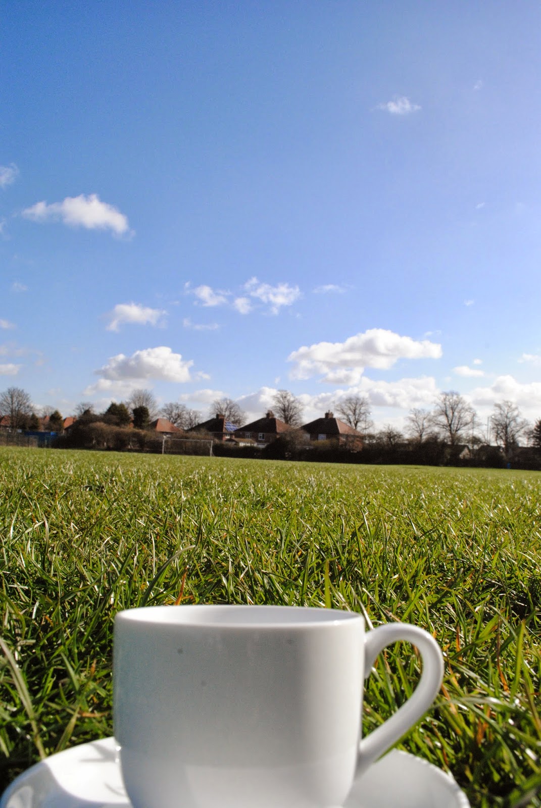
For this image the first thing you see is the center objects, but mainly the man sitting on an object. You see he is dressed rather casually, which makes you think this is a regular thing he does that isn't out of the blue or un expected. As stated it is in the center so it does follow the rule of thirds, making the viewers attention go straight to the man and enhances your focus specifically on him. As it does this you look closely at him to see that in fact he is very small, this makes you wonder what he is sitting on and is that just extremely large. Your eyes catch the ladder first as they are the leading lines up too and from the man who is sitting on the object. You see underneath him is an upside down tea cup, which is already quite small. This makes you realize that from the size of the ladder and from the size of the cup, he is a small world looking out to a big world. You then glance over the dandelions that are placed around the tea cup which almost show a peaceful safe soft place to land if he where to fall off the cup. It also shows that it has been decorated to look very pretty and inviting. As you have the ability to blow dandelions so that all the individual stems come off, shows that they are vulnerable and could relate to him being so small, and being alike in terms of vulnerability. You see that some of them have already been blown off and are floating in the wind, making the scene look peaceful and calm. They also show warmth as they grow in summer time, showing that the image is set in a warm sunny environment, making you feel summery or just like you want to go into a field and pick some of your own. You look below these dandelions to find a wooden box or trunk that he is on, which makes you assume there must be another set of stairs somewhere in order for him to get up there. You then go back to looking at the environment to see even more, but all you can really see is that there is a glare of sundown still bright and lovely sunshine on him, and the rest is just blurred, with faint outlines of trees. This makes all your attention automatically attach to the person, and just imagine the setting and interact more with the image.
It allows you to be in the image and imagine the persons perspective of what he is seeing. You also cannot see what he is seeing and as all the specifics of the scenery are blurred you cant even guess, which adds mystery. The fading of the background to smudge it out has a circular indent around where the mans head is which again refocuses your attention back around to the man again after looking at the sky and surroundings. You also get to imagine it from another's perspective looking at the little man on the tea cup and looking at the emphasis on his size by the ladder and other features around him. This image makes you feel happy as you get to see that he isn't in danger there's nothing bad going to happen or any sign that it will, hes just sitting looking at the massive world around him from such a tiny person on a beautiful day. It almost shows that we don't appreciate life enough and we don't have time to just sit and stare at our environment like this man does. Its almost motivating to make you want to go out on a sunny day and just sit absorbing the surroundings your in. This image has a central depth of field as everything around it is out of focus. In a way the image is both a shallow and deeper depth of field. This again is another way the photographer grabs the viewers attention straight on the man. You look at the image as a hole and see even though the staircase is only small it is still there and it resembles that it is needed a lot for some people, even though this is a more humors and magical way of displaying it.
From looking at this image you can imagine the texture of the ladder, as it isn't your average wooden or metal stair case, its more made out of lolly pop sticks to suit a smaller individual. This means that it could be smoother to touch and easier to climb. You also imagine what it would be like to sit on the cup would it be cold to put your hands on or extremely hot from the beautiful weather? You imagine the texture of the dandelions, if they would be good pillows for sunbathing for him what they feel like when your so small in comparison to barely feeling the individual strands as an bigger person. This just makes you feel apart of the image and want to be even more involved, by being there with the man who is clearly fascinated with his surroundings. The smudged background emphasizes his size contrasting with the scale of how big he is in comparison to the rest of the world. This makes the image more effective and more believe-able that he really is that small.
Images i have taken
Here i am displaying all the separate images i have taken, before i put them all together in photoshop. I see more potential in some of these than others, but here are a selection which i will choose from when i begin to edit. As Joel Robison uses the cup i have taken some shots to resemble his exact image, and then taken a few others which i felt would be an interesting compoition to show and emphisise the title of the image being 'its a small world'. The ones i can see being harder to work with than others are the first few below of the trees. this is because as the model will be small you wont be able to see them as clear and the ladder leading up will be in the greatest of focus. This isnt necaserily the aim as in thsi image his staricase is more dainty and small, and his model the opposite.In some of the images such as the last few of tea cups i played around with the focus and found that as Joel uses blurring in his image, i could experiment with the depth of field so it was more realistic than blurring in photoshop. This is where i will have to mix and match beteween the image of the model and the image i will use below to see which i feel looks best together and the most effective so i reach the full potential that Joel does in his images.


These are the the body postions of two modesl that i felt would be most suited to the type of images that i would try to portray. I had them in a variety of poses which i felt would look most effective and where similar yet distinctive to Joels images. As you can see some of them are sitting and some are taken of them standing so taht all my images wont look identicle and have a little individuality to them. The only problem i faced when taking some of these pictures as you will see is that there is my shadow which i found hard to make sure wasnt in the image, effectuing the light shining detail onto the model. To over come this i took photos where i had altered mny position so that you could see clearly where the image was taken. I photographed all these images at around mid day so they are all in excelltent sunny conditions. However once i had taken them i realised that they glare of the sun on some including the first one, may effect how realistic the image looks when i am to put the model onto one of the images above in photoshop. Even using the contrast and brightness tools the image still may not look as affective as i had first hoped. This To prevent this i took a few more in different day light or at different angles so that the sun wasnt so direct and the model wouldnt cause any over brightness problems in the later stages of editing.


Finished Response
Here i will display all my final pieces of my experimentation and each one photo shopped to the best i could make it. Below i will describe each in terms of their strengths, what they bring to the audience and how they can be developed.

The first part of this image that your eyes are drane to is the model as the highest center piece in the image. As you divert your eyes here along the way you see that he is on a bird. You then look around to see he is in the water directly in the middle of a lake as it seems which looks rather unsettled from the number and the density of the ripples. You then think how does he get out and look for how he can escape. Your eyes then divert to the left hand side that stands out due to it being further into the image in comparrision to the other side whwere it is just more water. You then analyse this section of the image to see that closest to toward the start of the ramp there is a disguissed ladder which is a way out for the person to climb. This is less obvious to see as i felt i would stick to the effect that joel robision has where his model is the most important part and the ladder is just aetsthetic design. As its not to the imediate attention it adds to the tension built whilst your looking around as you cannot see how such a small person can get off. The expression of the model and the fact he is stabalising himself whilst standing shows he is about to get off. As there is no sign of danger in the background or anything, the viewer doesnt really get a sense of worry or sadness, and concentrates more on the excitment of it as they consider whether he will get off without falling in or not. Further more, as there is no threat it allows the viewer to think more about how intreresting and imaginitive the image is that a person is actually on a duck floating through the water. The image does follow the rule of thirds as i have stated previously, i was following the theme that Joel uses in his by making the model the most important and the ladder the less obvious section. The only leading line in this image is the boarder of the ramp as it leads to the ladder. The ladder can also be suggested as a leading line as whenever you look in the water you look for the ladder once you have already seen it. As the image has a shallow depth of focus all the image is in focus so you can imagine the texture of the mud ramp on how stable it will be to tread on once he gets off the duck. You can also imaginge the duck interms of the models perspective on how soft it was or how wobbly it was due to the rippling water. The expression on the midels face allows you to put yourself in the models position and imagine how he is thinking and what he is going to do. To improve this image i would try to make the lighting of the model a little darker so that it appeared he was defiently suited to his environment, looking ever more realistic.

For this image the first thing you see is the model again as she is colourfullest thing against the contrasting colours in the back and center area. You also look straight at her as she is just off center, still fitting slightly in the rule of thirds criteria and stilll bringing all the attention to the center first half of the window and not outside of it. You then notice what she is sitting on and find that it is a very small window sill. As your eyes glaze around each side you see they are leading lines to the ladder next to her which falls under some leafs and vines. This makes it more magical and adventurous as its rare to see such a window sill and appears that she is adventuring and not just following a stair case that was naturally put there. You then re avert your eyes back to her to see she is looking into the distance, but more imprtantly to what she is focusung on. Outside of the window you then look around and see all the plantation and growth outside. It shows a bigger part of the that she is looking out on, just like in Joels version, but his has been blurred out. I felt the image looked more powerful where you could see what she was looking at rather than fading due to the atmopshpehere and the building in which she is perching in. You can imagine the view from her perspective and imagine how big it looks to her, making you appriciate and want to explore new parts of the world that just look ordinary to us. The shallow depth of field in this image really adds emphisie to the conditions of the place she in and as it gets slightly more out of focus, it makes you want to see more and to maybe zoom in and see it in a clearer focus. There is nothing negative about this image as it allows you to appriciate nature and shows you that it is wild and natural in this paticular state, breaking through man made barriers or creations such as the floor or walls. This could relate to the model as she is small overcoming her barriers of exploring larger and exciting thisng such as she is in this image. To improve this image i would lower the exposure of the model so that she isnt as bright and so that she fitted in with her surroundings more appropriatly. I could also manipulate the background of the image so that it had more ladders in to she she is looking out to her next destination but choosing whether she should and which she will choose to take. This would add even more story to the image and allow the viewer to imagine her perspective of the image even further.

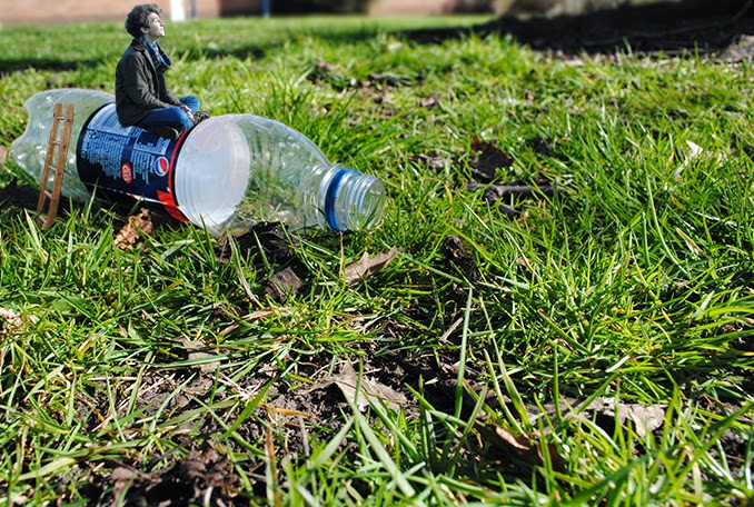
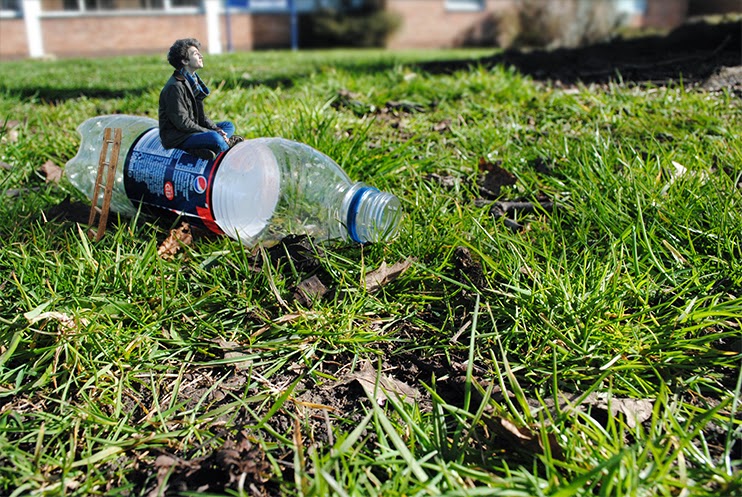
The first thing your eyes draw too in this image is the bottle as it stands out the most and is the biggest thing just off the center of the image. As the top of the bottle is in the center it fits with in the rule of thirds and also acts as a leading line to the model, which your eyes are then diverted too as he is the most protruding and biggest object standing out on the bottle.You then see that he is looking into the distance, so your eyes glaze ofver the rest of the image to see what he is looking at. You see the building in the far distance that is blurred due to the shallow deaphtt of field used in the image, which makes you want to try and see what it is is and set the scene of where he is. You also see the dark shadow across the grass which is assumed to be a tree from the roots. This makes the viewer consider whether he is thinking og going up it or admiring its natural beauty. As the model is smiling and there is no sign of sdanger through the colour of the sky or in anytjing around him, it makes you again like the imagae above appricite nature more, as the small person would see it as much more amazing than an average height person. The models attire suits the scenery as the leafs are scattered around the floor shwoing that it is autum time. As both of these are in focus it really allows you to imagine what its like to be in the scenery and if it is really cold. The sunlight shining shows that he is content and happy absorbing the sun. The beauty of the environment and the sun on his face contrasts with the bottle as the bottle was just rubbish that was found on the floor. This shows that even through all the litter around the place we live in he still admires the beauty if it. The viewer thinks about how the model actually got there and scans the bottle, where they find a small ladder going up the back of the bottle. Again, i wanted this to be more dicreate in comparison to the model as the model in the surroundings allows the viewer to really appreciate nature and even sends a message to people about litter. To improve this image i could add a shadow to the ladder so that it looked more realistic with the sun light that is coming through. I could also maybe crop ot the school in the back of the image as it is irrelevent and could distract the attention away from what the image should really be doing.

This first thing you see in this simage is the grate as it is the largest object, taking up the majority of the picture. More importantly, the first part of the image you see is the part of the grate closest to the kirb as the two leading lines then lead down to the model that is sitting and simply observing the the grate and maybe what is beyond. What you dont automatically see is the ladder that is coming out of the grate. In some cases this maybe the first but as there are leading lines in the grate leading to the ladder and there are leading lined from the kurb and grate to the model, your attention could be directed either way. This image doesnt really display a paticular emotion but it does make the viewer maybe imagine what the story is to the image. It makes them question, did she climb or or is she going to climb down?, did she climb up to get away from the darkness that you see under the grate? etc. With this in mind, as the position or expressionof the model doesnt tell the audience much it allows them to imagine it all themselves. This makes the audicence feel sorry for her if she was living in the grate and coming up to sit on the surface as you imagine that down there from your experiance already looking into grates and the darkness that you see in that one, that it isnt a plesant place to be. The rule of thirds isnt used in this image as i wanted to go for the opposite effect that Joel used in his image that i am responding too. I wanted to make both the ladder and the model more discreat to empisise the size of her in comparison to things such as grates. There isnt really any depth of field in this image as there is no background or landscape for the image to fade into like the others, but yet it stioll makes the image just as effective as its right there for your eyes to just fall onto with no frantic looking around the image to help you build up the image. To improve this image i would make the model a little darker in terms of contrast so she fits into the environment she is in. I would also maybe sharpen around the grate so that the plantation and the texture of it is a little more exagerated.


This is my version of theexact image i have been responding to by Joel. For both of these images i decided to use one with my favourite pose of my male model and one with my favourite pose of the female model. Out of both i feel the male model looks more realistic as the female is to bright and doesnt suit the environment she is in. However the male model is wearing clothes that from the first glance at the image doesnt suit the weather he is in.
With this in mind i feel the scenery and the ladder in the cup of each looks just as effective as Joels image, and alows you to consider what all my other responses have done in terms of appriciating the beauty of whatever the models are looking at and the environment they are currently in. I feel to improve both these images i should try a different model position and even blur our some of the buildings so that the attention is direct to the models, just as joel does in his.
Development Of Response
Here i will show how i have developed my response images. For the first image, i edited the model mainly so that they where a lot smaller than they originally where, added a Gaussian blur to make him look really there against the duck and the contrast of him so that he didn't stand out so much against the rest of the image. This has deffinelty improoved the image and has made it look a lot better. To create the Gaussian blur, the youtube tutorial really helped as i had used it in the past but o couldnt fully remember the steps to using it to the best of its ability. Realising that this video isnt doing the same type of image i am, it still helped me a lot and i knew what to do to relate it to my own image.
For the second image, i cropped it in so that the center attention wasnt taken away from the model on the bottle but stilll allowed the effect on the audience, to appriciate the surroundings as the image is still interesting with large backgrounds to empisise it. I also lowered the brightness of the model so that he suited the image just right in terms of the direction of sunlight on his face and his back being slightly more shaded. I feel this brings the focus in more on the main subject of the image and ensures the audiences eyes are directed exactly to where they are meant to be. The third image simply shows what it looked like before, but with the use of the blur tool so that you couldnt see what clearly what awaits in the background, and it also elongates the environment so it looks like an extremely big field he is sitting in. This then empisisses his size and the originality of the image along side it. The Fourth and fifth image are improvements of the originals i have again added a gaussion blur so it adds more of a realistic effect, making the audience blievbe they are really sitting on that tea cup. I have also altered the contrast on both so that they arent as luminous in comparison to the rest of the image. I then lastly cropped the image just as i did to the coke bottle image. This is because again i feel like it distracts the attention away from what the audience should realy be looking and inagining, which is the model. The sixth image was simply the adjustment of the contrast and a grey filter on the ladder along side some subtle sharpenung. This image didnt need as much editing as there wasnt much in the image to edit. However, the image does look a lot better as the model looks like she is sitting in that exact atmosphere and sun light. Finally, the seventh image was edited by making the model smaller so she actually suits the title and editing her contrast yet again. This makes her blend into the image and less obvious that she was photoshooppped on there. As i said in above analysis that i wanted to add more ladders, i then decided it would ruin the view if it was crowded with strairways. Therefore i added a staireway on the other side of the window sill and cut it so that it looks like it is leant on the other side for her to climb down on the other side when she is ready. This then allows the audience to think further into the next part of the image, and will she go down that way or did she actually come from that direction. To improve the images as a hole i coule experiment with more objects and settings such as match stick boxes etc that you associate with small 'elf' images. This would show that i would have considered the basics and original layout of these types of iimages and then gone and taken images of more exciting things like the duck or something even more extrodinary.


No comments:
Post a Comment