Below is the umbrella photo i created for my series of final images. I will then discuss how i got to that stage and what developments i made along the process. This is my original rough initial design of this image. My original design was shown below was to have someone walking across the top of umbrellas in a lighter happier and sunnier environment, whilst underneath it was the complete opposite with rainy and dark skies. I decided against this idea as i wouldn't have had time to complete it to the standard that i would have wanted. However if i left myself more time and explored around on photoshop i would have definitely used this as one of my final images.

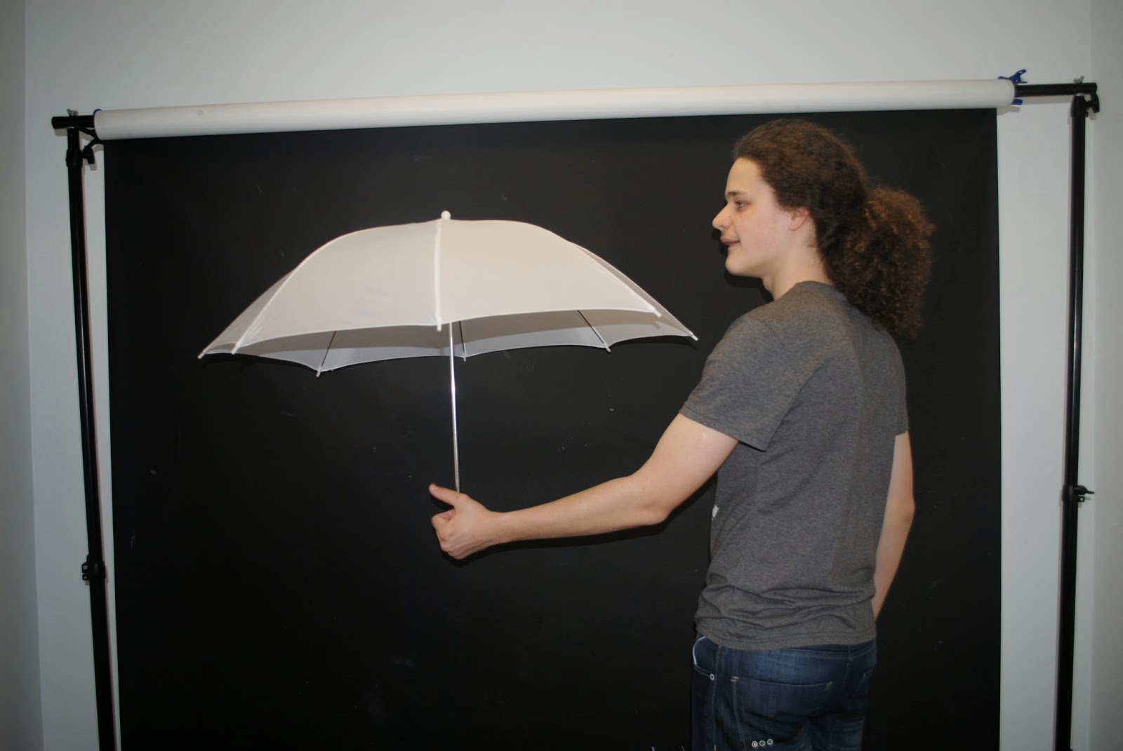
When beginning taking my first images for this image, i didn't have an umbrella that was exciting or quirky to add a more thrill to the image. I also didn't have one that was black which would really set the dark gloomy mood i wanted the image to have. However, when my model took out the soft light umbrella in the studio,it gave me an idea to use that instead of buying one that may not have looked as good. The angle my model held it at will allow me to Photoshop the image effectively so it is leveled as if it is being stood on. I will then be able to make the umbrella as dark as possible through the brightness and contrast feature. I then went out particularly on a dark and rainy day to get some landscapes of a field that it would be best suited to the atmosphere i wanted to give off. However, in these images there where no clouds just clear darker sky and rain. To make the image more effective and to suit what my idea is, i decided to include my own skies that i had previously taken and make them a lot more dull so they make the hole image more worrying.


First images
For my first images i wanted to explore with perspective, so i added an image where my model is looking out too the landscape which is lead by a number of umbrellas in each position.The image is taken as if it where someone just looking behind him which will liase more with the audience making them want to imagine what its like to see such a wonderful landscape. To improve this image i would have to add a darker more silhouette image onto my model and maybe explore with the blur tool to show that as they get further away they become less visible. For the second image i decided it would be interesting to see what the umbrellas would look like across a landscape rather than from a perspective point of view. This is a more happy and jolly version of what my original intention was, as the sky is bright the fields are bright vibrant green and it appears to be a sunny day. To improve this i could suit it more to my original idea by making the atmosphere a lot more sinister. Again the layer where the model lies is too bright against the rest of the image making it look highly unrealistic.


Second Images
for my second versions i developed the first image by adding shadows in the water, emphising there floating presence above the water. I however didn't complete the rest of the adjustments i said as i wanted to first see how effective the image would be. I feel that they look unrealistic, and even if i was to involve the addition of a Gaussian blur at a different opacity, it still wouldn't look at appealing. For the second image, i made the sky darker and added a model position that was less happy and more appropriate to my original idea. It allows the viewer to contemplate what he is thinking. To improve this i would make the grass and the rest of the image darker so it sets the seen more. The environment clashes with friendly happiness against the uncertainty of the dark and grey clouds.


Third images
for my third set of images i added a darker brightness on the model layer, and added an blur to the umbrellas that where traveling from further out. This has definitely improved the image and as i did it for the image that does have shadows, i could clearly see which image was too busy and which looked more simple and eye grabbing. I then went on to create an even darker sky that you can see below. To differ this image even further i added a much better motion captured image of my model leaping so that to look like an excellently focused image. Out of the two i personally prefer the first as it looks more of a challenge that he is running from the darkness that is waiting him where as the other looks like he is just simply running into it. I am most certainly considering this as my one of my final selection images, due to the power it brings just from his position never mind the rest of the image.


After looking as my images i felt that the landscape and concept looked a lot stronger going through the shaded silhouette of the lake. So as the body position was so good in my last most prefer end image and the elements of the second, i joined them both together to see exactly how strong they re together. I feel that this image is a lot better than each as individual images due to there being a lot more to see and explore your eyes around. If i was to improve this image, i would try to do some more experimentation work into backgrounds that would defiantly suit the umbrellas and the model even more as he leaps up the stairs.

No comments:
Post a Comment